Performance
Redesigning a highly-used and complex iOS application built for the iPad to increase usability for pilots in the field.
Discovery
What don’t we know? What are we missing? Who are the users?
Timeline: 3 weeks
Participants: Devs, Product Owner, QA, UX
I began by researching the app, and its users, with a few high-level goals in mind.
- How does the app function?
- Who uses the application?
- What are their main pain points?
How I added value with research:
Interviewed the product owner to glean how they will measure success and gather participants for 35-45 minute scripted interviews, including one user, a notetaker, and a facilitator (me). This helped me get unfiltered feedback from users and avoid the anchoring bias from leadership.
Synthesized interview notes to form our personas and identify pain points; Dev and QA were involved in this process to build empathy for the user. This allowed the team to find common concerns across participants and backlog the one-offs. This also helped form a common ground for the team and product owner to use during discovery.
Built empathy and journey maps to zoom out and understand both the context of the app within a pilot’s workflow and how they used the app. We learned this app was one small step in the larger process of building a flight plan, so we narrowed our focus to improving the app's core, “Can a pilot takeoff or land?” while addressing usability and accessibility concerns.
*Due to proprietary restrictions, I cannot share findings in detail.
Define
How might we alleviate the user’s pain points without disrupting their workflow while increasing usability and meeting business goals?
Timeline: 1 week
Participants: Devs, Product Owner, QA, UX, Scrum Master
Now that the team had a solid foundation to build upon, we needed to come together and define clear opportunities for the scrum team to prioritize during release planning.
From a UX perspective, what would I focus on during the next 6 months to meet my goals? Time to write some user stories!
The product owner was debriefed with our suggestions to make edits and be ready for questions before release planning with executive leadership and stakeholders.
How I informed the app’s release:
We needed to build the right thing. Then, we’d build the thing right. Based on discovery research, I sought out opportunities to deliver more bang with less buck and to set some ground rules for myself.
Test usability of the existing app with actual users. Have them perform scripted goals with a facilitator and notetaker. They helped me overlap pain points found during discovery with actual results from testing. We used a new user group of five people for this effort, this group was unaware of the previous group’s pain points.
Perform a UI Audit to target trouble areas and communicate them effectively with the product owner. This also helped senior leadership visualize wasted energy in redundant design and dev efforts.
Propose a design system, something Gulfstream did not have at the time, and since the app was being built from scratch, this was the perfect opportunity to make broad strokes to solve UI concerns. This also would give me a chance to work iteratively and parse work into deliverable bits for each sprint. The design system would be built as a byproduct of the project, a nice investment!
Design
It was time to rely on our research to design the building blocks that would define the app’s voice and tone.
Timeline: 5 months, delivered in two-week sprints
Participants: Devs, Product Owner, QA, UX, Scrum Master
Starting with the log-in experience, I went through the app section by section to create UI elements that repeated and built upon themselves.
Applying an 8pt grid in all components meant I was able to work faster and invest more of my time in the interactions and less in the spacing, look, and feel of the UI.
Design Strategy
Focus: usability, readability, proportions
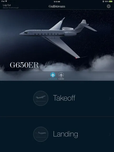
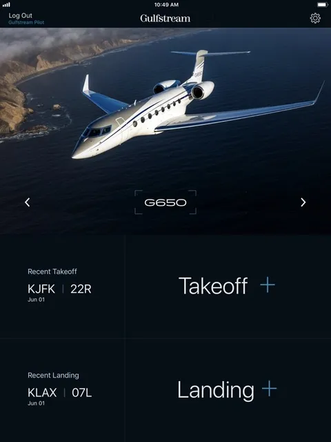
The previous home screen was flat, unbalanced, and lacked interaction clues to move the user to the next step.
Adding simple icons and color revisions gives the users clues about what is interactive without relying on color. I also removed all icons that did not serve a purpose.
I also replaced existing typography with Apple’s San Francisco and increased the contrast to help with readability.
Luckily, Gulfstream had just rebranded, and I had a broad selection of aerial photographs using the new livery to choose from.
Interface Design
Focus: usability, data grouping
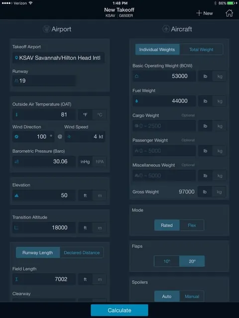
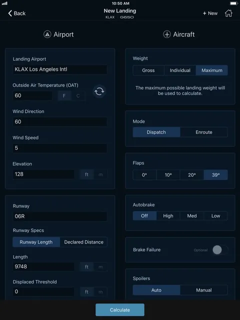
Increasing usability was the main goal in the calculation screen as pilots spent most of their time here running “What if?” scenarios, i.e., “Can I land in Aspen in 40 degrees with 65,000 pounds?”
My intent was to group fields in the order a pilot would use to perform a calculation. This is where they “turn the knobs.”
The outcome is more straightforward, easier to read, and offers clarity in a dense interface.
Output Data
Focus: simplify, structure, readability
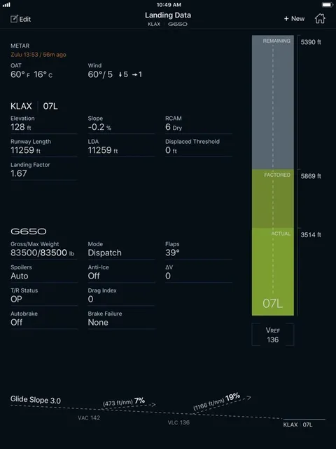
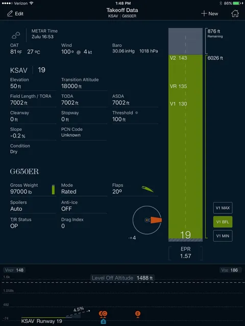
My first goal was to remove the noise generated by unnecessary icons. Items like the weather, wind sock, flaps, weight, etc., were deemed “frivolous” by the pilots we interviewed, and they just got in the way.
I also introduced an eight-point grid to build a structure for the data to live in. If another data point was needed, we knew exactly where it would go on the output screen.
Deliver
Results: The Performance app was successfully shipped to Apple on time, meeting the original business goal of rewriting the app in Swift and our UX goal of increased usability.
Wins: By building a system, I could join another project and onboard an associate designer to the Performance team for professional growth. That designer was promoted to bigger projects in a mid-level role and eventually to a senior role.
Bumps: We were unable to achieve the items proposed later in the project. Landscape mode and far-field obstacles were backlogged. The scrum team took longer to “form” than expected. However, we found our rhythm by holding transparent retros at the end of each sprint.
Byproducts:
- Pattern library for iOS
- Defined color scheme
- Foundation to build future pilot apps
Originally built in Sketch, we ported it to Figma for easier maintenance and better collaboration.
How I worked efficiently:
Created wireframes and micro-prototypes with Sketch, Invision, and Flinto for testing and validation—this was much less expensive before the devs started building in Xcode. We could make edits on the fly and get buy-in before user stories were pulled into the sprint.
Defined how certain interactions would function within the application through repeatable patterns built in a shared library using Sketch components. This allowed me to build the design system in concert with sprint deliverables.
Communicated with developers using component names to construct functions in the app, “We’re going to use three-segment controller sort data….” By following Apple’s Human Interface Guidelines, we were building a flexible app that would update easily in future iOS releases.
The outcome of Steven’s work has set the benchmark for a clean sheet approach to UX in our applications. End customers and independent competitors have both expressed huge praise on the ease of use, style, and presentation of these apps.
Sr. Project Manager, Innovation, Gulfstream Aerospace
Testimonials
“Few people have the opportunity to report to a supervisor who is also a coach and mentor - but I did when I worked for Steven when he took on his role as eCommerce Director.
During the two years I directly reported to Steven, he prioritized my professional growth and created an environment of collaboration and teamwork. I admire his ability to handle tense working dynamics with patience and integrity. He led our team to launch and implement several massive projects successfully. I had an incredible experience under his leadership, and I highly recommend him.”
“He not only provided incredible mentorship to me but also put systems in place to encourage team members to mentor each other in their "skill gaps." Between that and his championing of external-facing resources like the Style Guide, Process Guide, Collaboration Rooms, and UX Conference, he allowed the UX team to influence a far greater audience and make a larger impact despite our limited headcount.
I would 100% recommend Steven to any organization that values their people and wants to make a larger impact on both results and on the people that create results.”
“Steven has an incredible ability to quickly understand the complex challenges we were trying to solve and offer extremely innovative solutions. The outcome of Steven's work has set the benchmark for a clean sheet approach to UX in our applications.
End customers and independent competitors have both expressed huge praise for the ease of use, style, and presentation of these apps. Much of that praise should be directed at Steven for both conceiving the ideas and mentoring his team to produce similarly excellent results.”
“Steven understands better than almost anyone I've ever worked with that, at the end of the day, marketing is truly about finding that balance between stakeholder buy-in and an end product that will effectively communicate the client's message and achieve the desired KPIs.
Steven understands that marketing isn't about one channel but about bringing multiple channels together under a coordinated message and creative. He works diligently to bring teams together to achieve that coordination.”
“Steven is a fantastic designer. He's flexible and takes feedback well - which means he's great as part of an opinionated team and produces great work.
Steven jumped right into things when he started with us and never took his foot off the gas. He dealt with troublesome board members, technical limitations, and tight deadlines with grace and agility - something that I've found to be pretty rare when it comes to designers. I can't recommend Steven highly enough and would love to work with him again.”
“Steven has some amazing skills in the UX and design space. While we worked together, I was always impressed with his positive attitude and visionary ideas.
Steven did a great job with his team; not only did he meet the demands of his customers, but he was able to develop and inspire his team and others. He is a great sounding board for ideas and always left me feeling inspired and energized after we interacted.”